Celestia is an Italian VRChat community: nights out, worlds to explore and new people to meet. For the release of its new map I followed the whole communication path, from the campaign that built the anticipation to the visual identity Celestia presents today.
01 — The campaign
Anticipation first
Before the map release the goal was to build anticipation and hype. The idea was to start from a deliberately confusing, glitched identity, with disturbed frames, the symbol breaking apart and messages like “Stay tuned”, and then reveal the new identity and release the new map right after. The teaser runs 15 seconds and ends by announcing the launch trailer on 18 September 2026 and the celestiaita.it website.
02 — The world
The meeting point
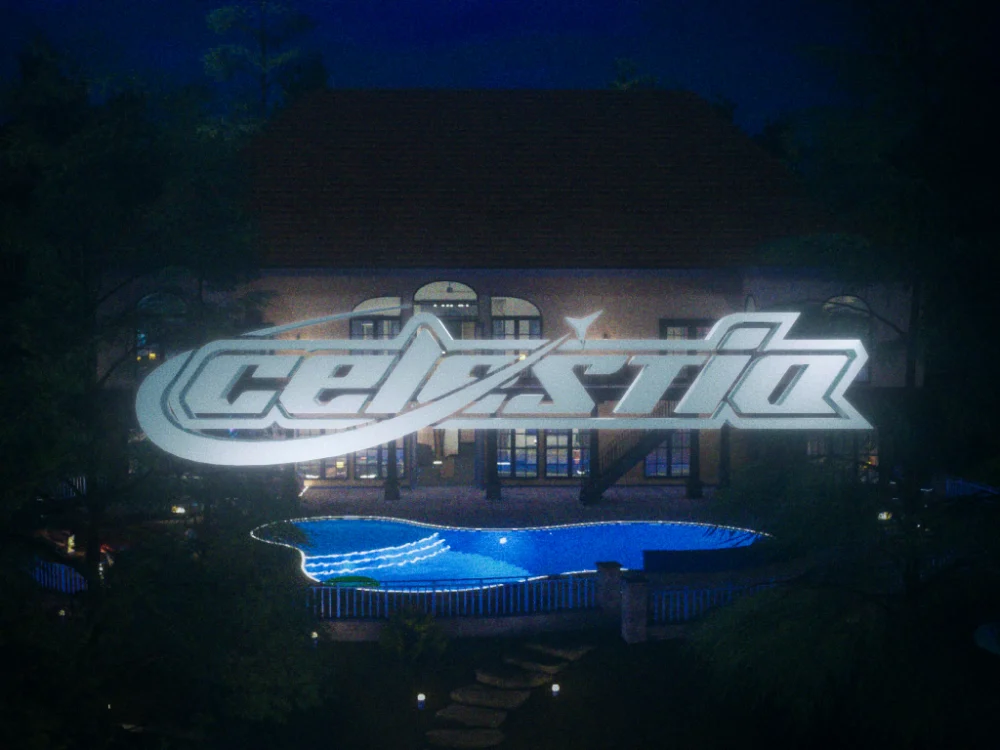
The map was designed by Kaira S and the version shown here is the Halloween one. I took care of the graphic resources.
03 — The identity
Moodboard identity
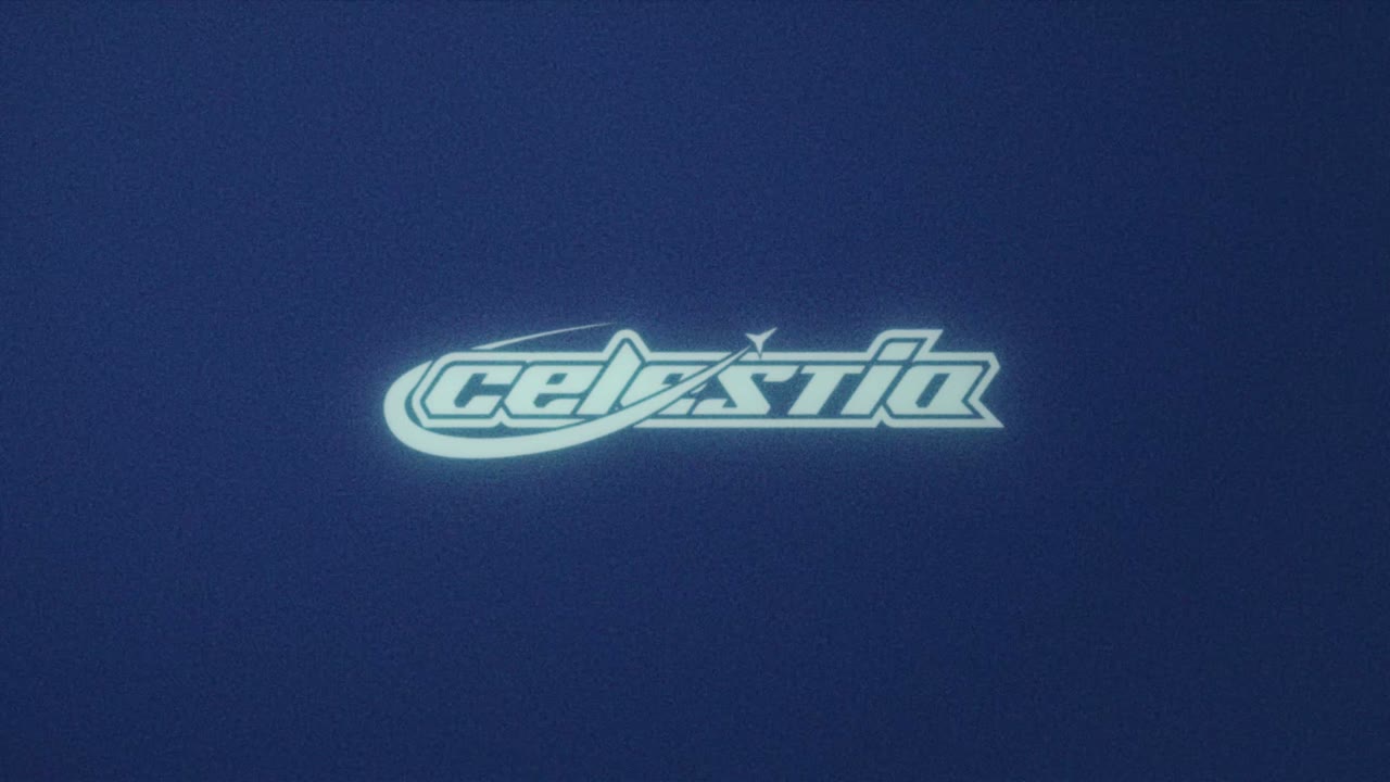
The new identity follows the moodboard: cold light, deep shadows and a dark ground, with the logotype and symbol treated as 3D chrome objects inside the VR worlds. The system is built on flat colors and a desaturated perspective grid, never relying on neon pink or purple. Below, the moodboard in four boards: the Day version, the primary mark, the secondary mark, and palette and typography.
Color and typography
- Abyss#071218Main ground
- Deep Orbit#0F2129Surfaces, panels
- Orbit Teal#1F3946Grid, borders
- Signal Haze#567481Haze, guides
- Chrome Silver#C2C7D0Symbol, swoosh
- Starlight#F2F4F7Text, Day version
- Nebula Indigo#3E3B53Logotype fill
- Pulsar Cyan#7FE3F0Accent, CTA
- Ember#FF6A1AHalloween only
The palette follows a 70 / 25 / 5 ratio: 70% is dark ground, 25% tones, silver and text, and 5% is the Pulsar Cyan accent for calls to action and live states. The Ember orange exists only during the Halloween season. For typography I chose Unbounded for titles, wide and geometric, so it contrasts with the italic logo instead of competing with it; Manrope for texts, captions and interfaces; JetBrains Mono for HUD-style labels, dates and times. The logotype lettering stays unique and no typeface imitates it.
The Halloween version
For the Halloween season the identity lights up in Ember orange, the only moment the color is allowed. Besides the main version I made themed versions of the logotype and symbol, with ghosts, pumpkins and a lantern.
04 — Posters and flyers
A layout to be recognized
Posters and flyers follow a specific layout to keep the identity consistent: logotype at the top, JetBrains Mono labels, Unbounded titles, a QR code to join the community and the call to action in Pulsar Cyan. For the Halloween event the layout stays the same and only the accent changes, becoming Ember.
Credits
Map: Kaira S.